

 SEOGUN
Grid에 대해 알아보도록 합시다.
Lazy V(H)Grid
List와 Grid의 차이
Grid는 List와 친척이라고 생각하시면 됩니다. 일단 Grid 와 List의 차이를 간단하게 그림으로 보겠습니다.
LazyV(H)Stack과의 차이는 다음 게시물에서 다루겠습니다,

List
List는 일반적으로 Vertical Direction 으로 목록을 나타내 준다고 보시면 됩니다. 가장 많이 사용되는 View 라고 생각하시면 됩니다.
Grid
Grid는 horizontal Direction으로 사진을 배열하여 화면을 구성하기 좋습니다.
가장 좋은 예로 Instargram / Pinterest / Netflix 의 레이아웃을 떠올리시면 됩니다.

Grid
Xcode에서 코드로 어떻게 사용하는지에 바로 알아보도록 하겠습니다.
우선 Grid가 어떤 식으로 되어있는지 확인해볼게요.

오..! LazyVGrid는 columns를 사용하여 반드시 GridItem이라는 매개변수를 같은 변수를 생성해줘야 하네요!
struct ContentView: View {
//목록을 1부터 1000까지 만듬
let data = Array(1...1000).map { "목록 \($0)"}
//화면을 그리드형식으로 꽉채워줌
let columns = [
GridItem(.adaptive(minimum: 100))
]
var body: some View {
}
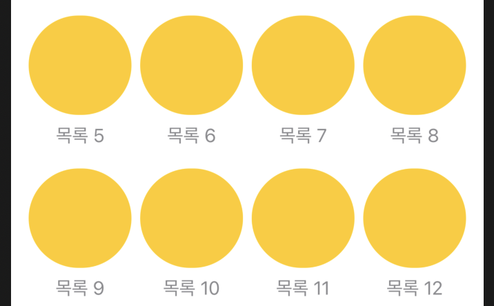
}GridItem(.adaptive(minimum: ) 저는 레이아웃의 최소 사이즈를 100으로 일단 정해서 화면을 그리드 형식으로 꽉 차게 만들었습니다. 이제 ScrollView로 화면을 구성해주도록 하겠습니다.
LazyVGrid
이 단계에서 알아야 할 것은 LazyVGrid입니다. LazyVGrid를 작성해보면 자동으로 어떻게 사용해야 할지 아래 사진과 같이 나오게 됩니다.

    var body: some View {
        ScrollView {
            LazyVGrid(columns: columns, spacing: 20) {
                ForEach(data, id: \.self) {i in
                    Text(i)
                }
            }
            .padding(.horizontal)
        }
    }
만약 목록 위에 사진이나 도형을 추가하려면 어떻게 해야 할까요? 바로, VStack을 이용해야 합니다.
        ScrollView {
            LazyVGrid(columns: columns,  spacing: 20) {
                ForEach(data, id: \.self) {i in
                 //VStack으로 도형추가
                   VStack {
                        Capsule()
                            .fill(Color.yellow)
                            .frame(height: 50)
                        Text(i)
                            .foregroundColor(.secondary)
                    }
                }
            }
            .padding(.horizontal)
        }
이렇게 Grid형식으로 뷰를 구성했습니다. 그럼 만약 '목록1'부분을 한줄로 꽉 채우고 싶다면 어떻게 할까요?
위에서 'let columns = [ GridItem(.adaptive(minimum: 100))' 우리는 최소 레이아웃 사이즈를 100으로 설정했습니다. 이 부분을 수정해보도록 하겠습니다. .adaptive()를 삭제하고 .flexibel() 확장자를 사용합니다.

flexible의 최솟값과 최댓값을 할당해줘도 되지만, 만약 두 가지를 모두 쓰지 않으면 기본값으로 자동으로 화면을 꽉 채워줍니다.
이렇게 최솟값과 최댓값을 적어주지 않으면 사용자가 아이패드 또는 아이폰 미니 등을 사용해도 꽉 찬 화면을 볼 수 있겠죠?
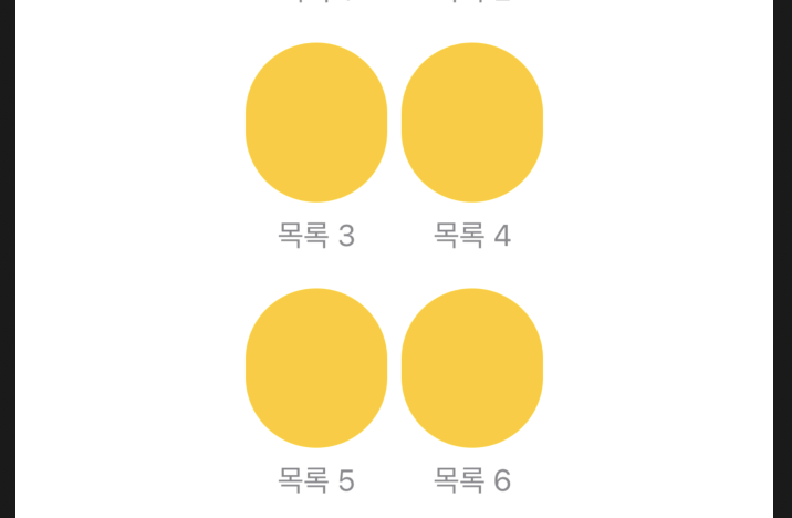
    let columns = [
        GridItem(.flexible())
    ]
layout쪽에 GridItem을 추가해보면 어떤 뷰가 생성될까요?
    let columns = [
      //추가 하면 할수록 화면에 보여지는 개수가 변함
        GridItem(.flexible()),
        GridItem(.flexible()),
        GridItem(.flexible()),
        GridItem(.flexible())
    ]

화면의 여백이 너무 크다면 최댓값을 정해줘 보도록 하죠 :)
    let columns = [
        GridItem(.flexible(maximum: 80)),
        GridItem(.flexible(maximum: 80))
    ]
예시
import SwiftUI

struct ContentView: View {

    let columns: [GridItem] = [
        GridItem(.fixed(50), spacing: nil, alignment: nil),
        GridItem(.fixed(50), spacing: nil, alignment: nil),
        GridItem(.fixed(50), spacing: nil, alignment: nil),
        GridItem(.fixed(50), spacing: nil, alignment: nil),
        GridItem(.fixed(50), spacing: nil, alignment: nil)

    ]
    var body: some View {

        LazyVGrid(columns: columns) {
            ForEach(0..<50) { index in
                Rectangle()
                    .frame(height: 50)
            }

        }
    }
}
고급 예제
LazyGrid의 인스펙터를 확인해보면 아래와 코드를 확인할 수 있습니다.
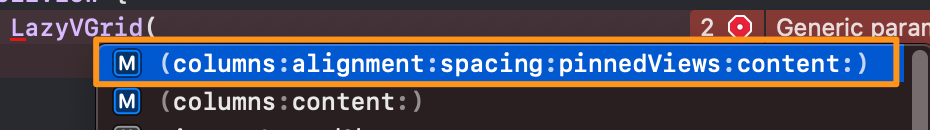
이 인스펙터를 사용해보겠습니다. 우선 columns라는 변수를 하나 만들어주고 할당해주겠습니다.
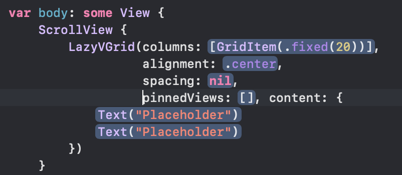
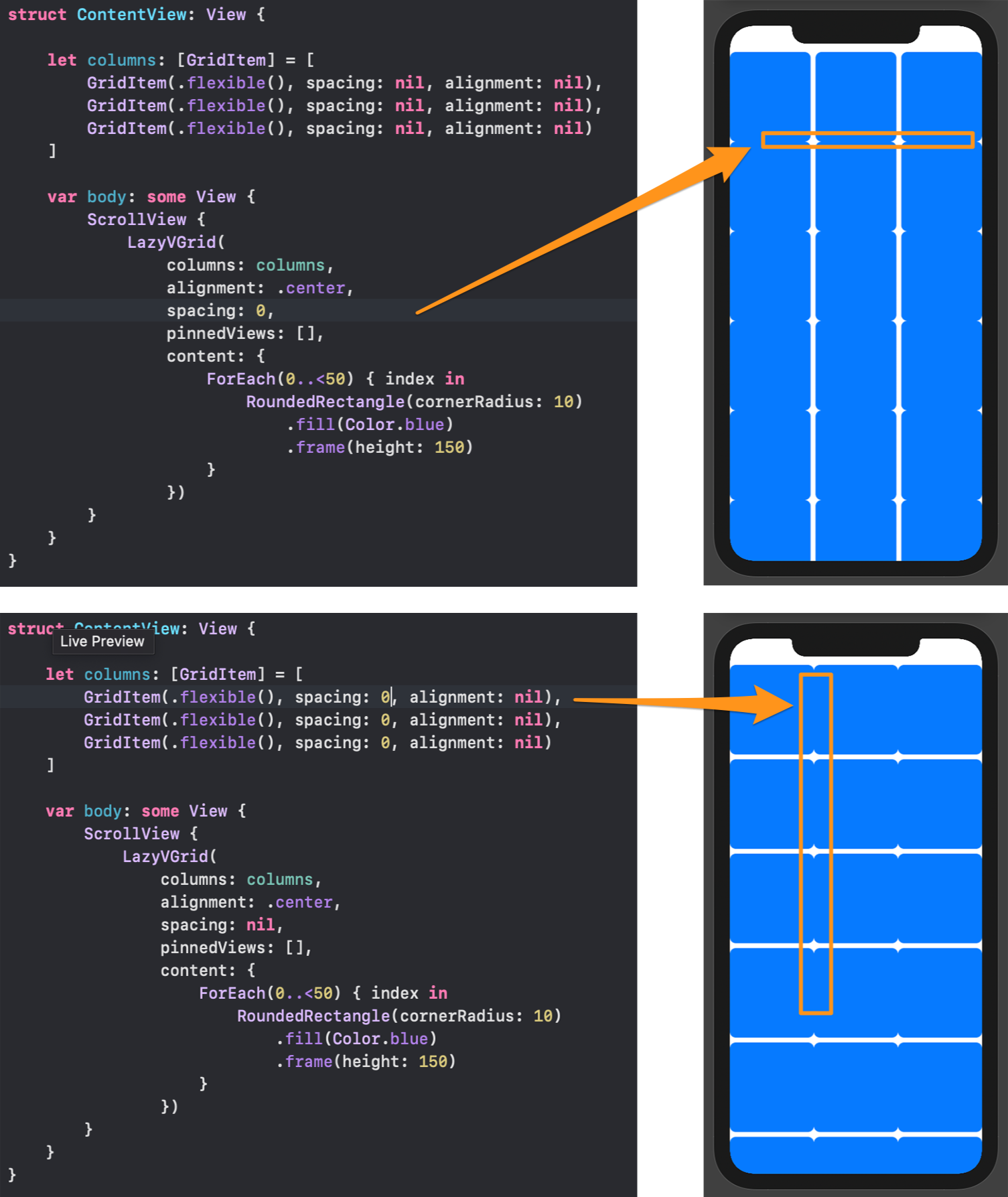
    let columns: [GridItem] = [
        GridItem(.flexible(), spacing: nil, alignment: nil),
        GridItem(.flexible(), spacing: nil, alignment: nil),
        GridItem(.flexible(), spacing: nil, alignment: nil)
]GridItem에 flexible수정자를 넣어 화면에 꽉 찰 수 있도록 해줬습니다.
import SwiftUI

struct ContentView: View {

    let columns: [GridItem] = [
        GridItem(.flexible(), spacing: nil, alignment: nil),
        GridItem(.flexible(), spacing: nil, alignment: nil),
        GridItem(.flexible(), spacing: nil, alignment: nil)
    ]

    var body: some View {
        ScrollView {
            LazyVGrid(
                columns: columns,
                alignment: .center,
                spacing: nil,
                pinnedViews: [],
                content: {
                    ForEach(0..<50) { index in
                        RoundedRectangle(cornerRadius: 10)
                            .fill(Color.blue)
                            .frame(height: 150)
                    }
                })
        }
    }
}
Spacer()
body의 LazyVGrid spacing을 수정해가면서 간격 조절해보도록 하려고 합니다.
Section 추가
Section을 추가해서 한번 뷰를 구성해볼게요
ScrollView {
    LazyVGrid(
        columns: columns,
        alignment: .center,
        spacing: 6,
        pinnedViews: [],
        content: {
            Section(header:
                        Text("첫 번째 섹션")
                        .font(.title)
                        .foregroundColor(.white)
                        .frame(maxWidth: .infinity)
                        .background(Color.accentColor)

            ) {
                ForEach(0..<10) { index in
                    RoundedRectangle(cornerRadius: 10)
                        .fill(Color.white)
                        .shadow(radius: 10)
                        .frame(height: 150)
                        .padding(5)
                }
            }
            Section(header:
                        Text("두 번째 섹션")
                        .font(.title)
                        .foregroundColor(.white)
                        .frame(maxWidth: .infinity)
                        .background(Color.accentColor)

            ) {
                ForEach(0..<10) { index in
                    RoundedRectangle(cornerRadius: 10)
                        .fill(Color("Peach"))
                        .frame(height: 150)
                        .padding(5)
                }
            }
        })
}

이제 아주 재미있는 기능을 하나 해보려고 합니다. pinnedViews를 우리는 [ ]로 아직 설정해주지 않았습니다. 이것을 다뤄보도록 할게요.
우선 pinnedViews[] 에 .을 입력해보면 아래와 같이 스니펫이 등장합니다.

위에서 우리는 Footer은 작성하지 않고 Header만 만들어줬기 때문에 header만 작동할 것 같죠? 바로 적용하고 결과 화면을 보도록 하죠!
전체 코드
<hide/>
import SwiftUI

struct ContentView: View {

    let columns: [GridItem] = [
        GridItem(.flexible(), spacing: 6, alignment: nil),
        GridItem(.flexible(), spacing: 6, alignment: nil),
        GridItem(.flexible(), spacing: 6, alignment: nil)
    ]

    var body: some View {
        ScrollView {
            Rectangle()
                .fill(Color.yellow)
                .frame(height: 400)

            LazyVGrid(
                columns: columns,
                alignment: .center,
                spacing: 6,
                pinnedViews: [.sectionHeaders],
                content: {

                    Section(header:
                                Text("첫 번째 섹션")
                                .font(.title)
                                .foregroundColor(.white)
                                .frame(maxWidth: .infinity)
                                .background(Color.accentColor)

                    ) {
                        ForEach(0..<10) { index in
                            RoundedRectangle(cornerRadius: 10)
                                .fill(Color.white)
                                .shadow(radius: 10)
                                .frame(height: 150)
                                .padding(5)
                        }
                    }
                    Section(header:
                                Text("두 번째 섹션")
                                .font(.title)
                                .foregroundColor(.white)
                                .frame(maxWidth: .infinity)
                                .background(Color.yellow)

                    ) {
                        ForEach(0..<50) { index in
                            RoundedRectangle(cornerRadius: 10)
                                .fill(Color("Peach"))
                                .frame(height: 150)
                                .padding(5)
                        }
                    }
                })
        }
    }
}
마치 CSS의 sticky처럼 header가 고정되고 바뀌는 게 정말 재미있는 기능이네요 :)
기본적으로 LazyHGrid도 위와 동일하게 작동하기 때문에 LazyHGrid에 대해서는 간단하게 알아보도록 하겠습니다.🤟
LazyHGrid
위에서는 LazyVGrid를 사용했다면 가로로 스크롤을 배치하고 싶을 땐 LazyHGrid를 사용해야 합니다.
위에서 썼던 코드를 수정하여 사용하도록 하죠. 수정해야 할 부분은 ScrollView와 LazyVGrid쪽 입니다.LazyVGrid에서 사용됐던 columns 이 rows로 바뀐 것을 확인할 수 있습니다.

struct ContentView: View {

    //목록을 1부터 1000까지 만듬
    let data = Array(1...1000).map { "목록 \($0)"}

    //화면을 그리드형식으로 꽉채워줌
    let layout = [
        GridItem(.flexible(maximum: 80)),
        GridItem(.flexible(maximum: 80)),
        GridItem(.flexible(maximum: 80)),
        GridItem(.flexible(maximum: 80))
    ]

    var body: some View {
     //스크롤뷰를 horizontal로 수정
        ScrollView(.horizontal) {
          //LazyVGrid에서 LazyHGrid로 수정
            LazyHGrid(rows:layout, spacing: 20) {
                ForEach(data, id: \.self) {i in
                    VStack {
                        Capsule()
                            .fill(Color.yellow)
                            .frame(height: 30)
                        Text(i)
                            .foregroundColor(.secondary)
                    }
                }
            }
            .padding(.horizontal)
        }
동일한 결괏값 다른 코드
import SwiftUI

struct ContentView: View {

    //화면을 그리드형식으로 꽉채워줌
    let layout = [
        GridItem(.flexible(maximum: 80)),
        GridItem(.flexible(maximum: 80)),
        GridItem(.flexible(maximum: 80)),
        GridItem(.flexible(maximum: 80))
    ]

    var body: some View {
        ScrollView(.horizontal) {
            LazyHGrid(rows:layout, spacing: 20) {
                ForEach(0...1000, id: \.self) { i in
                    VStack {
                        Capsule()
                            .fill(Color.yellow)
                            .frame(height: 30)
                        Text("목록 \(i)")
                            .foregroundColor(.secondary)
                    }
                }
            }
            .padding(.horizontal)
        }
    }
}
읽어주셔서 감사합니다🤟
본 게시글의 전체 코드 GitHub 👇🏻
Seogun95/SwiftUI_Grid_TUT
Grid에 대해 알아봅시다. Contribute to Seogun95/SwiftUI_Grid_TUT development by creating an account on GitHub.
github.com
'SWIFTUI > View layout' 카테고리의 다른 글
| SwiftUI : Picker / Picker Style / Section (0) | 2021.05.13 |
|---|---|
| SwiftUI : Sheet / FullScreenCover (@Environment / presentationMode) (0) | 2021.05.11 |
| SwiftUI : ScrollView (1) | 2021.05.08 |
| SwiftUI : Form (Toggle / disabled / If ) (0) | 2021.03.19 |
| SwiftUI : ZStack ( Spacer / offset / zIndex ) (0) | 2021.03.15 |

 GitHub
  Seogun.blog
  Email
Email 


 한국어 (기본)
 English
 Русский
 日本語
日本語
