

 SEOGUN
ProgressView 에 대해 알아보도록 합시다.
ProgressView
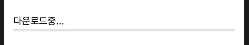
ProgressView("some text", value: someBinding, total: 100)SwiftUI는 가로로 된 진행률 즉 ProgressView하기 위해 Double에 Binding 할 수 있습니다.
예를 들어, "다운로드 중"이라는 제목의 진행률바(progress bar)가 만들어지며, 진행률바(progress bar)가 downloadAmount 즉, 얼마나 꽉 찼는지 결정합니다.
ProgressView는 진행중이든 아니든 혹은 완료를 했든 진행 유형을 모두 표시 할 수 있습니다.
진행 상황을 나타내는 숫자 값과 작업 완료를 나타내는 총 값에 대한 Binding으로 ProgressView를 초기화하여 ProgressView를 결정 짓습니다. 기본적으로 progress는 0.0이고, total은 1.0입니다.
struct ContentView: View {
                               //기본적으로 더블값을 할당
    @State private var downloadAmount : Double = 0.0

    var body: some View {
        VStack {                                           //총값: 100
            ProgressView("다운로드중...", value: downloadAmount, total: 100)
                .padding()
        }
    }
}
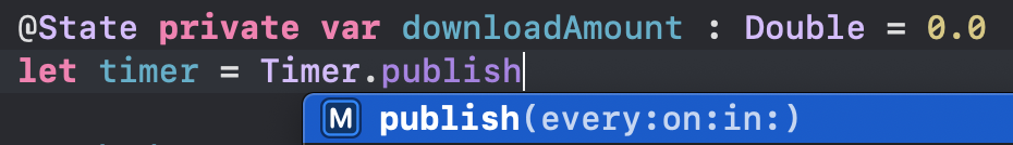
이제 실행을 하면 자동으로 타이머가 네트워크 요청 또는 기타 사용자 인터페이스와 같이 해당 값을 실제로 변경할 수 있는 방법이 필요합니다. 예를들어 몇 초 동안 진행률 표시 줄이 채워 줄 수 있게 할 수 있습니다. 일단 바인딩 아래에 timer코드를 추가해주겠습니다.
@State private var downloadAmount = 0.0
let timer = Timer.publish(ever: 0.1, on: .main, in: .common).autoconnect()
Timer 뒤에 publish 까지 작성하면 자동으로 코드가 생성됩니다.
변수를 만들어 줬으니 .onReceive를 사용하여 데이터를 탐지하고 액션을 취할 수 있도록 추가해줘야 합니다.
onRecevie란? 데이터를 탐지하고 액션을 취하며 event를 내보낼 때 작업을 트리거하는 view 입니다
var body: some View {
VStack {
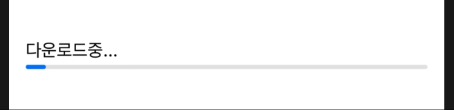
ProgressView("다운로드중...", value: downloadAmount, total: 100)
.padding()
}
.onReceive(timer) { _ in
//만약 downloadAmount가 100보다 작다면 실행
//total값 보다 작아야함
if downloadAmount < 100 {
downloadAmount += 5
}
}
}
}
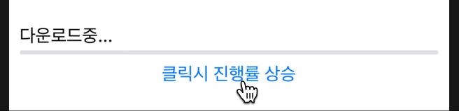
Button을 누를때마다 진행률 증가
struct ContentView: View {

    @State private var downloadAmount = 0.0

    var body: some View {

        VStack {
            ProgressView(("다운로드중..."), value: downloadAmount, total: 100)
            Button("클릭시 진행률 상승") {
                     //총값을 지정하지 않으면 컴파일 오류가 생김
                if downloadAmount < 100 {
                    downloadAmount += 5
                }
            }
        }
        .padding(10)
    }
}
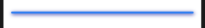
ProgressViewStyle
CirularProgressViewStyle()
ProgressView(value: someBinding)
       .progressViewStyle(CircularProgressViewStyle(tint: .red))
       .padding()
LinearProgressViewStyle()
struct ContentView: View {

    @State var progress : Double = 0.3

    var body: some View {

        ProgressView(value: progress)
            .progressViewStyle(LinearProgressViewStyle(tint: .red))
            .padding()
    }
}
PickerStyle 커스터마이징
Progress bar에 스타일을 만들어 진행률바를 꾸며줄 수 있습니다.
레이블을 완전하게 사용자 지정하거나 완전하게 새로운 ProgressViewStyle을 만드려면 프로토콜을 구현해야 합니다.
struct MyCustomProgressViewStyle: ProgressViewStyle {
    func makeBody(configuration: Configuration) -> some View {
        ProgressView(configuration)

        // Your custom code here

    }
}
struct DarkBlueShadowProgressViewStyle: ProgressViewStyle {
    func makeBody(configuration: Configuration) -> some View {
        ProgressView(configuration)
            .shadow(color: Color(red: 0, green: 0, blue: 0.6),
                    radius: 4.0, x: 1.0, y: 2.0)
    }
}
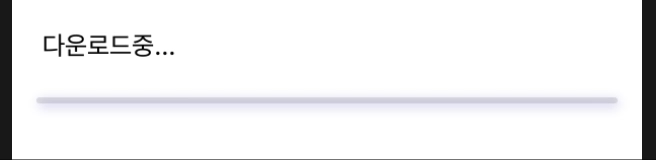
이제 이 ProgressViewStyle을 적용 시켜주겠습니다.
    var body: some View {

        VStack(alignment: .leading) {
            Text("다운로드중...")
                .padding(.leading, 20)

            ProgressView(value: downloadAmount, total: 100)
                .padding()
        }
          //VStack 밖에서 호출
        .progressViewStyle(DarkBlueShadowProgressViewStyle())
        .onReceive(timer) { _ in
            //만약 downloadAmount가 100보다 작다면 실행
            //total값 보다 작아야함
            if downloadAmount < 100 {
                downloadAmount += 5
            }
        }
    }
전체 코드
import SwiftUI

struct ContentView: View {

    @State private var downloadAmount = 0.0
    let timer = Timer.publish(every: 0.1, on: .main, in: .common).autoconnect()

    var body: some View {

        VStack(alignment: .leading) {
            Text("다운로드중...")
                .padding(.leading, 20)
            ProgressView(value: downloadAmount, total: 100)
                .padding()
        } //VStack 밖에서 호출
        .progressViewStyle(DarkBlueShadowProgressViewStyle())
        .onReceive(timer) { _ in
            //만약 downloadAmount가 100보다 작다면 실행
            //total값 보다 작아야함
            if downloadAmount < 100 {
                downloadAmount += 5
            }
        }
    }
}


struct ContentView_Previews: PreviewProvider {
    static var previews: some View {
        ContentView()
    }
}
//progressViewStyle
struct DarkBlueShadowProgressViewStyle: ProgressViewStyle {
    func makeBody(configuration: Configuration) -> some View {
        ProgressView(configuration)
            .shadow(color: Color(red: 0, green: 0, blue: 0.6),
                    radius: 4.0, x: 1.0, y: 2.0)
    }
}
읽어주셔서 감사합니다🤟
본 게시글의 전체코드 GitHub 👇🏻
Seogun95/SwiftUI_ProgressView_TUT
ProgressView 와 ProgressViewStyle에 대해 알아봅시다. Contribute to Seogun95/SwiftUI_ProgressView_TUT development by creating an account on GitHub.
github.com
'SWIFTUI > View layout' 카테고리의 다른 글
| SwiftUI : 반복되는 뷰 Struct (0) | 2021.02.08 |
|---|---|
| SwiftUI : ColorPicker (0) | 2021.02.07 |
| SwiftUI : Label(사용자 라벨스타일 만들기) (0) | 2021.02.07 |
| SwiftUI : Lazy V(H)Stack (0) | 2021.02.06 |
| SwiftUI : SearchView (0) | 2021.02.03 |

 GitHub
  Seogun.blog
  Email
Email 


 한국어 (기본)
 English
 Русский
 日本語
日本語
